eSalon Hair Color Profile
Improving the acquisition flow of a beauty-tech company by 12%.
2015 – 2016


Responsive mobile designs for eSalon’s Hair Color Profile
Role: UX and UI Design, Information Architecture, Copy
Team: Internal Product, Creative, Tech, Acquisition Marketing Teams
The Challenge
A beauty-tech company, eSalon creates and sells custom home hair color. Clients must fill out a color profile to place their first order. The answers to the profile define the rules that eSalon’s technology uses to formulate each client’s unique color. The profile is the main acquisition flow for the business.
The founders of the company wanted to improve the profile completion rate.
There were problems in the experience. With over 20 questions the quiz is long. It was also cumbersome, asking users to first make a selection then tap a “continue” button after every answer – especially tedious since most users completed the profile on mobile devices. The language was awkward and didn’t feel conversational.
The previous version of eSalon’s hair color profile:

Approach
All of the questions were required to formulate the hair color, so we couldn’t shorten the “quiz”. To explore better ways to organize all of the questions, I stripped the experience down to just text. I wanted the color profile to feel more like the back-and-forth consultation one might have at a salon and also give users a sense of progress. An early iteration of that organization is below.

A/B Testing
There was little appetite for launching a dramatic change all at once. So through a series of phased A/B testing, the product manager, marketing manager, and I defined the optimal order for the questions. I redesigned the UI and introduced the progressive interaction style that auto-advances clients through the experience. The dev team worked tirelessly and heroically through all of these tests, and provided guidance around the any issues that might arise in formulation from adjusting the order of operations. The hard work and patience paid off with a 20% higher completion rate and 12% higher conversion rate.
Test 1
New organization and order of the questions to make sure we had no major drop-off in general. It was an easy win so we moved on.
Test 2
Rewrite the questions to be more friendly and conversational in collaboration with a brand copywriter. Add in “tips” on a key questions to help clients give better answers.
Test 3
New hair color imagery that the creative team was working on simultaneously.
Test 4
New UI and illustrations from the brand creative team and new auto-advance behavior.
Results and Issues
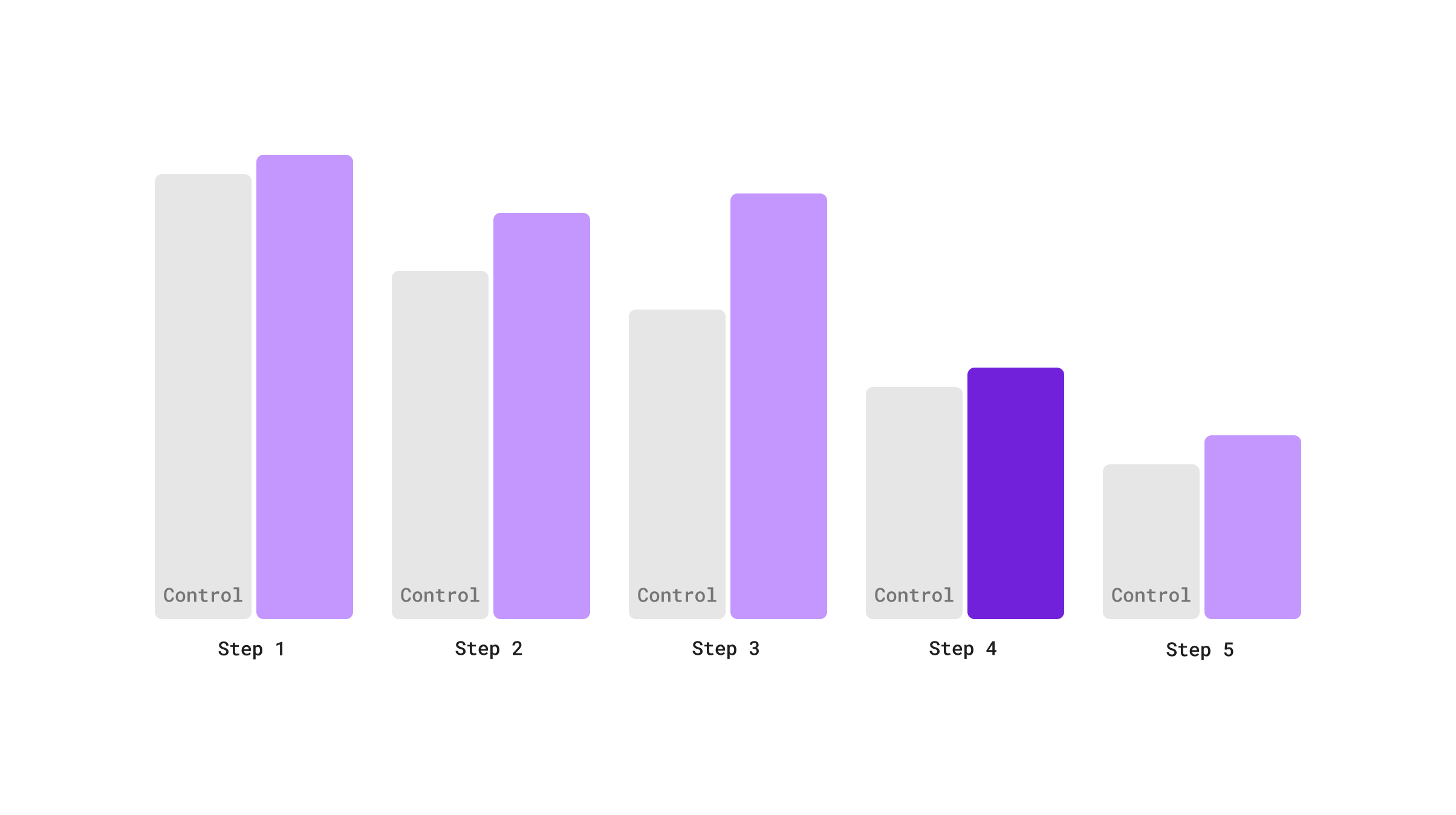
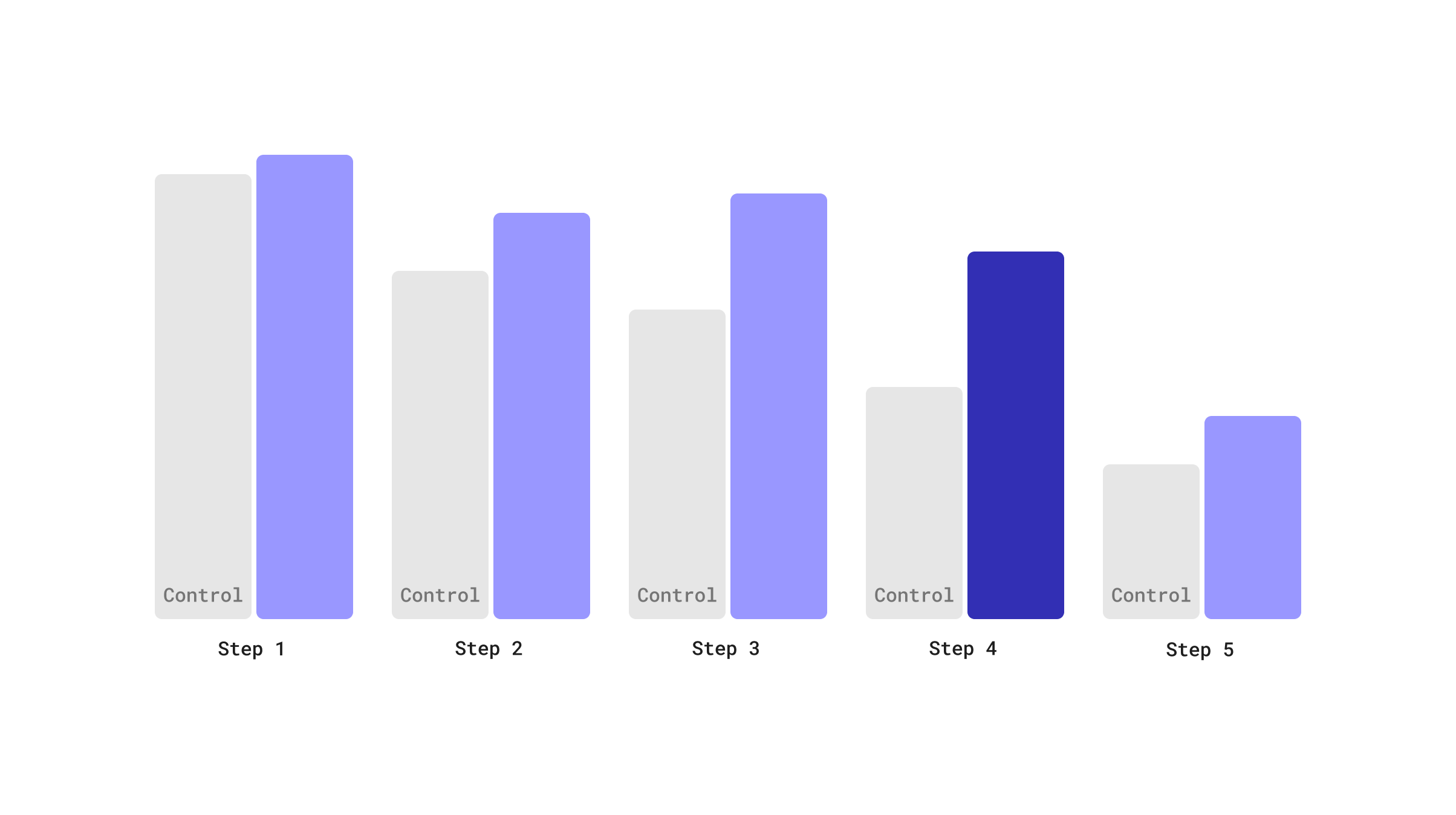
The new designs were winning the tests overall, but steps 4 and 5 still had higher drop-offs than we would have liked. Step 4 was where user selected their desired hair color. It had complex chart of color options that many clients found confusing.
Data to the Rescue
The data analytics team told us that we had enough historical data about success rates with color that it would be possible to provide recommendations instead of showing all available options. The logic being that if a client currently had “x” hair color, we knew that other clients with the same color had repeat orders of “x, y, and z”. Repeat orders signifying happiness with the color that they purchased. Most clients really did just want something to their current color, so that helped us significantly simplify the experience for a majority of people.
So we went from this color chart:

To just a few shades:

And improved drop-off significantly.
20% higher completion rate and 12% higher conversion rate.
Personas We Targeted


The End Result –
A Successful Model for Future Products
After iterating and improving on designs over the series of tests, we landed on the designs below using fonts and color palette defined by the brand team. We performed separate tests for checkout and had ongoing A/B tests for the step where clients opt-in to the subscription plan throughout my tenure with the company.
Most users go through this experience on mobile so I recommend viewing it live here.
eSalon is still using the majority of this design today and implemented the same content organization and interaction style when launching the in-person Color Studio as well as their men’s hair color. They also are using a similar design for their custom hair care line.


