Equelle Responsive Website
Redesign and responsive update to subscription supplement website improves conversion by 6%.
2020–2021

Project Overview
The Challenge
Equelle is a menopause symptom relief supplement. I collaborated with their Brand Manager on a responsive redesign of their Shopify website to:
Improve Conversion Rate
Improve Quiz Completion Rate
My Role
Improve the content organization and discoverability of product claims.
Improve the mobile experience with responsive designs.
Refresh the look & feel.
Content Organization
There are many competitive products claiming to address menopause symptoms and we needed to do a better job explaining why Equelle was better than the rest. Though this site is small, there were a number of content challenges to address. Equelle had recently done some great market research:
Top 3 characteristics that influence purchase:
Is effective in reducing menopause symptoms
Has few side effects
Is safe for long-term use
Top barriers to using treatment:
I am concerned about potential side effects
Don't know enough about the product
The medication costs more than I am willing to pay
Approach
After performing a content audit it was clear that the current site had the information needed to address the issues above, but the message was muddled with repetitive content across multiple pages. I recommended simplifying the shopping portion of the site to just two pages, Homepage and Product Page and gave each one a high level user need to answer. They could drive to FAQs and clinical studies if the user wanted more information. Both pages needed to address the supplement points above.
Homepage
“Why Should I Choose Equelle?”
Addressing user concerns like symptoms, safety, and effectiveness were key to addressing the “why”. User tests proved that displaying trust elements like patient satisfaction rate improved the likelihood a user would convert. Making it clear that Nature Made had conducted successful clinical trials without overloading the page with too much information helped keep the message streamlined.
We had a lot of back and forth with the legal and copy teams in an attempt to make the less clinical but were only moderately successful, so I relied on imagery and testimonials to help make the page more human.
Figma Embed
Scroll inside the device viewport to see the full mobile screen of the homepage.

Product Page
“Is Equelle right for me?”
The product page needs to motivate users to purchase. So along with communicating symptom relief, this page addressed allergy concerns and transparency about how long the supplement would take to work.
To ease the burden of high cost, but also promote the subscription language, I dropped in “pause or cancel anytime” language that I knew to have been effective in previous e-commerce work I’d done. The 60-day moneyback guarantee at the top and bottom of the page were also there to help convince buyers.
Figma Embed
Scroll inside the device viewport to see the full mobile screen of the product page.

Quiz Refresh
In this quiz all roads lead to “You should try EQUELLE” so I questioned its value. But the numbers proved that users who took it converted at a higher rate. So we:
Improved/simplified the messaging on the results page, adding symptom relief content and stats to emphasize Equelle’s research approach.
Removed the email requirement to see quiz results to increase completion rate
Updated the visual design.


Quiz Results

Visual Design
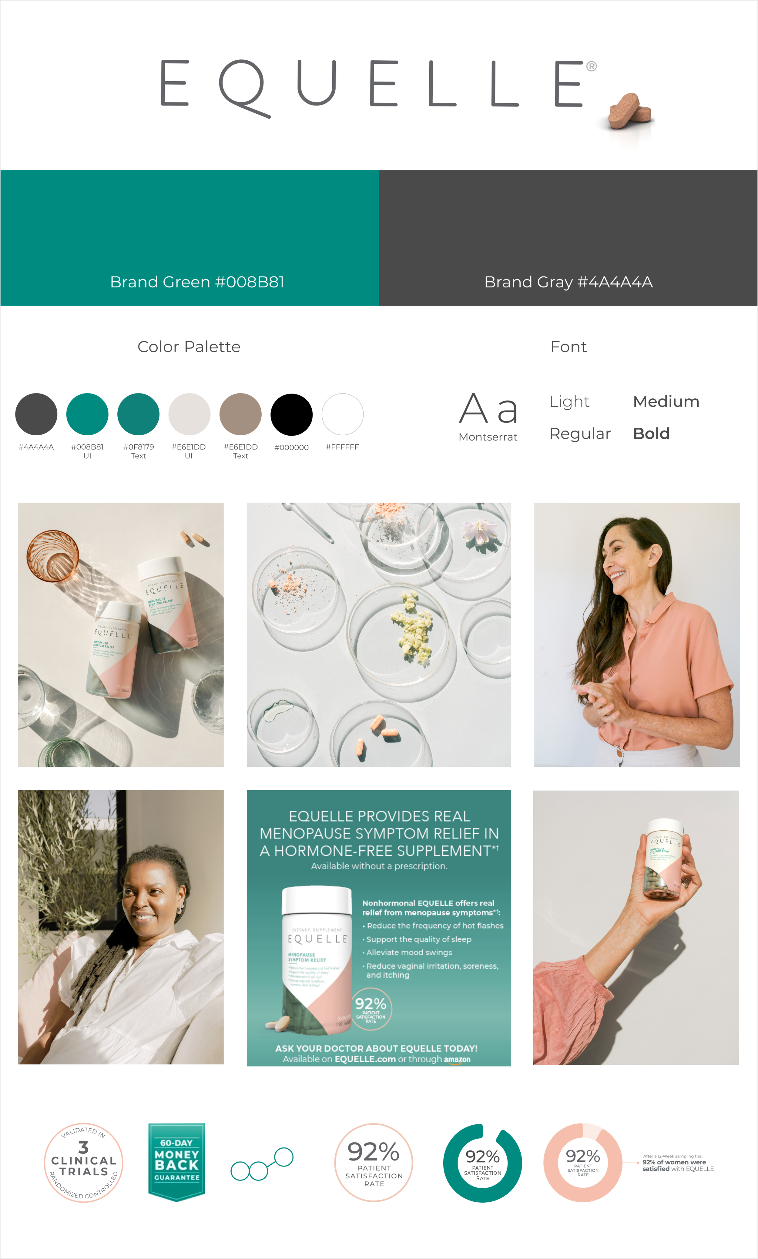
This was a site geared toward an older demographic, so it was important to make the design straightforward with clear, large typography and color contrast.
Menopause symptoms can create a lot of stress for women. We wanted to present Equelle as a lifestyle improver – not a drug – with enough scientific backing to be seen as trustworthy. It needed to live up to the upcoming campaign message:
“Equal Parts Science and Symptom Relief”
There were no existing brand guidelines. The Brand Manager asked that I draw color inspiration from the recently updated bottle design, and borrow the font used by their parent company, Nature Made. Using existing photography, I put together the light brand board (below) for us to move forward with and built a style guide later for developers.