Design Lead / Copy / Design System
Redesigning the Bay Area’s Public Media App
KQED is the San Francisco Bay area’s public media provider. They had an app but it was limited to radio. I joined the mobile team in 2021 as a consultant to defined the podcast experience. From 2022 – 2024, I was the lead designer on a larger redesign intended to broaden the app’s appeal beyond the listening audience. The app was built using Flutter and runs on iOS and Android phone or tablet.
Business Goals:
Increase users age 30–50.
Convert them into repeat, known (signed in) users.
Include more of their content (news, tv, video, events)
The New Direction
KQED as a whole was aligned that they wanted a more content-rich app, but with so many stakeholders they struggled to agree on a direction. They hired an agency, Metalab, to provide high-level direction.
The simple way to keep informed and connected to the Bay Area community.
To build that connection, the app would lean-in to the local aspect of KQED’s offering, allowing users to personalize their “Local” tab experience by selecting topics and neighborhoods to follow. User research showed that most people consume news content while multi-tasking, so the app would make it easy to be informed by scanning top level screens.
User Needs:
I want quality content from trustworthy sources.
I want easy access to relevant and engaging content.
I want to be up to date and feel connected locally.
The agency’s design concepts. Tap to view larger.
My Role
Though the concept was approved by stakeholders, it was not executable because KQED’s existing content did not support the agency’s proposed designs, nor did it follow brand guidelines. My goal was to maintain the spirit of the original idea but turn it into something that could be launched in 8 months.
Only onboarding and the top level screens had been considered by the agency. I partnered with KQED’s Product Manager and Design Director to define the full experience. I also ensured it met accessibility and brand standards, was successful in light and dark modes, wrote copy, and created new prototypes for user testing.
Team
In creating the design system, I collaborated closely with the developers from Uptech Studio who built the app in Flutter. I was on the project until just before launch when an internal designer took it on. She also created the “scribble” illustration style seen on a few screens.
Please note: The KQED design, brand, and editorial teams created all artwork and photography.

Figma Prototype
The app has long content feeds. The best way to see the full screens is with the prototype embedded below that I created for user testing. Scroll the mobile viewport or click/tap to navigate around.
Optimizing Onboarding
The winning onboarding flow. Photo illustrations by Bryan Bindloss and Molly Wu.
The Onboarding Flow Must:
Communicate the value proposition of the app.
Encourage users to personalize.
Prompt users to sign in.
The agency created an onboarding flow, but KQED’s content did not support the neighborhood level of personalization proposed. The flow seemed too long and I questioned the need to describe expected functionality like “save for later” and “on the go”. KQED’s design director was not comfortable with the visual design so we collaborated on new ideas to user test.
The agency’s original onboarding designs. Tap to view larger.
Challenges for New User Tests:
Can we reduce steps while still communicating the app’s value prop?
How can we still include location without being so granular?
Where/how can we include sign in/sign up without creating drop off?
How can we make it look and “sound” more like KQED?
How can we adjust the art to be easy to update and support dark mode?
Our Process
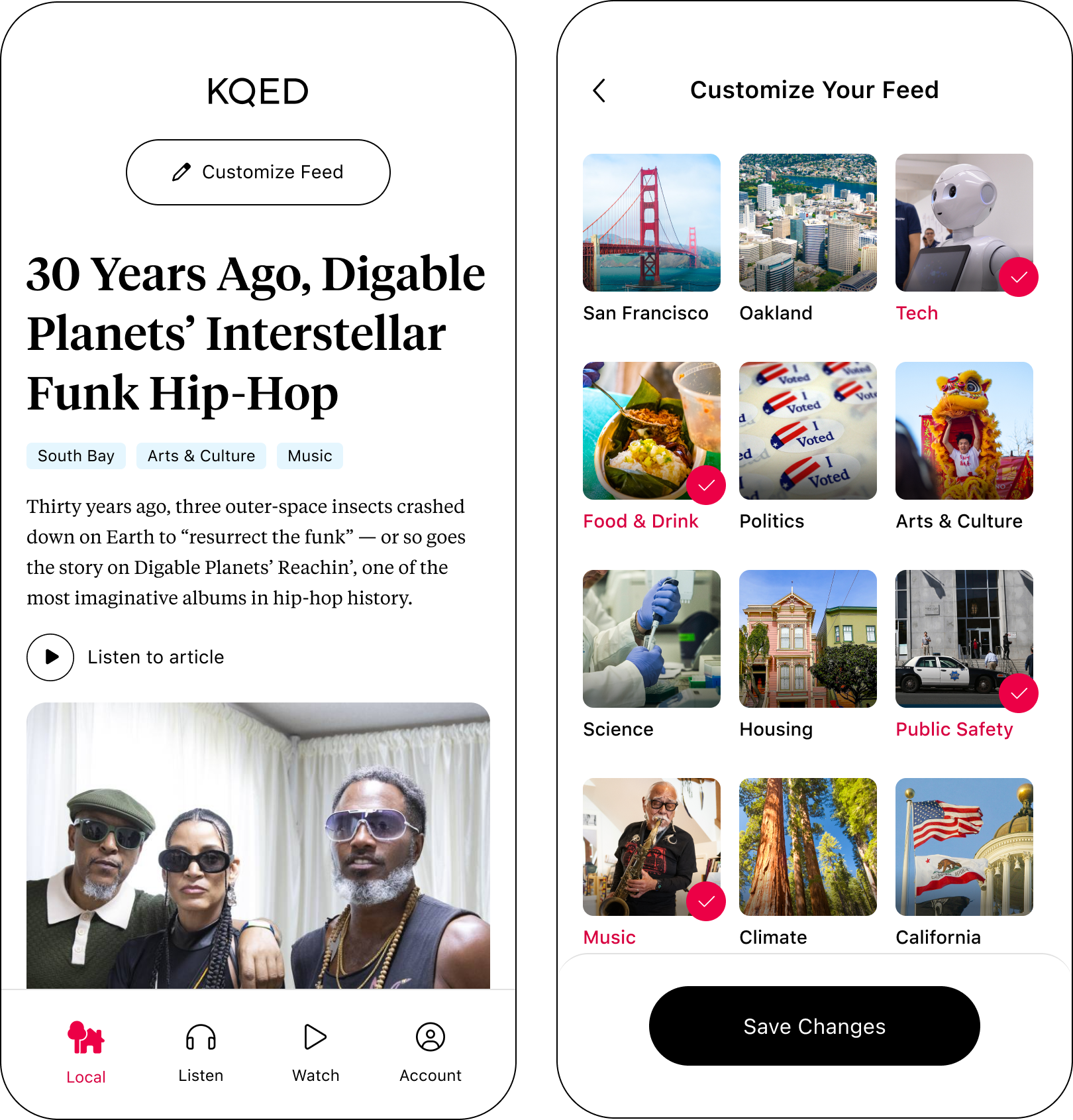
Nailing personalization was vital since it would act as a content filter. The editorial and product teams worked together to define Bay Area regions that they had enough content for that filtering by them would result in a good news experience. They ended up with 5 or 6 areas to test.
The design director and I iterated through messaging that would speak to the user need of a “trustworthy news source” and communicate the benefit of personalization. And while he worked on imagery, I worked on designs for the flow and UI, and started building a new design system. Some ideas we tested:


User Test Feedback
The image of mother and daughter resonated most with users, it felt “real”. As did phrases like “stories that matter”.
Users didn’t trust the social sign in options prioritized on the sign-in screen. Action: moved email sign in to the top for the next test.
The pills at the top of the Local feed that reflected the users selected personalization options were noisy and looked too much like navigation. Action: proceeded with the simple “customize” button for future tests.
Users loved the ability to “customize” or “personalize”, but some wanted the option to “select all”. Action: saved to test after MVP launch.
Users thought the + symbol on the topics feed would open more options. Action: Removed in later tests, user would simply tap a photo to select the topic.
The winning designs in dark mode.
Photo illustrations by Bryan Bindloss and Molly Wu.
Other Takeaways
There were more tests, but they mainly involved different iterations of images that the KQED designers created using the above flow.
Putting text on a flat background made switching from light to dark mode easy. It was also better for accessibility purposes because there needs to be room for text to grow if a user makes it larger, the background makes this possible.
Thinking of locations as “topics” themselves, allowed us to combine news categories and regions. This lightened the comprehension load and moved users through the experience faster.
Watching users go straight from onboarding into the newsfeed felt jarring. Inserting a loading screen ahead of the feed that told users what they were about to see better set up expectations.
Content Organization
We had a strategy and great research, but the content organization and UI needed to be defined. I had the benefit of working with KQED for almost two years prior to this effort, so I was familiar with the content that was already being created for their website.
The app’s content would be pulled from, but not mirror, the website.
To fulfill the mission of being “easy to keep informed” and not alienate the current app listeners, the app would:
Only show the most recent 20 news stories based on a users stated personalization preferences, not all stories hosted on KQED.
Make radio, newscasts, and podcasts easily discoverable. Newscasts get tons of streams.
Reusing What Worked

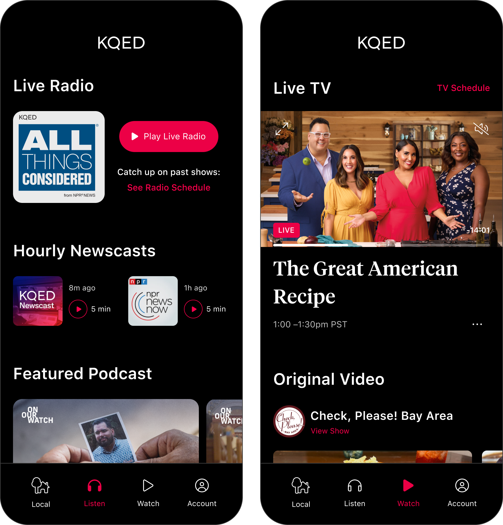
The Listen tab is the home for live radio, newscasts, and original podcasts. We had recently launched these features in KQED’s previous app and they performed well (see study results), so we carried over the same functionality to use our limited time wisely, and updated the UI to the new visual design style.

Design Process
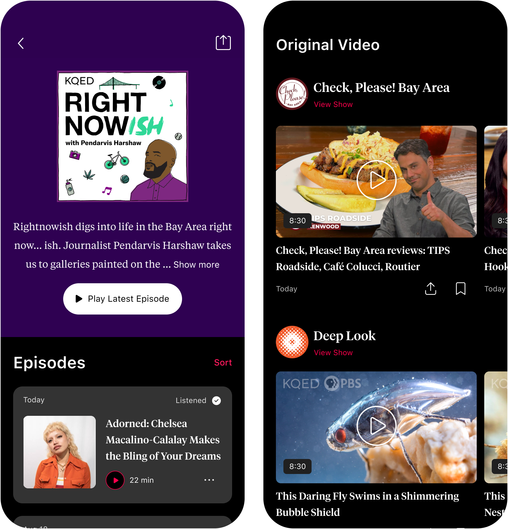
Creating that initial podcast experience required thinking through the many interactions and app feedback needed to support expected behaviors like saving/unsaving, downloading, and sorting episodes. I performed a competitive analysis of major podcast apps, and met with their podcast team to understand their goals and frustrations with the existing web-based podcast experience. From there, I proposed a feature set and design concepts to share with stakeholders and the dev team.


Original version of micro-interactions on the left that were carried over to new app on the right.
After the stakeholder review, I iterated to support api limitations, and worked through error handling with the developers.

Podcast Learnings
Shortly after the features launched in the initial app, I ran a user study to measure overall podcast UI comprehension and discover any issues in audio playback. We learned that overall comprehension of the podcast controls were better than expected, but users prioritized news headlines and radio over podcasts, which led to a reprioritization of content. That learning carried over to the new app with the Local feed and headlines appearing on the first tab.
Live TV and Original Video
The watch tab is home to live TV and original video. I iterated on a number of directions because KQED has a large video catalog and the video team wanted users to have access to it all. Ultimately, that seemed like a larger undertaking than would be possible for a short timeframe, so the recommendation was to limit the shows to those still being produced, including social vertical video.
TV would autoplay but on mute, tapping the video will unmute the player and reveal the full TV schedule below. A prototype of the idea is here.


User Account
We knew that KQED donor members like to be able to access their member card since they get discounts using it around the Bay Area so it was featured prominently. Along with accessing their account settings, any signed in user, donor or not, will find their saved and download content in this section.
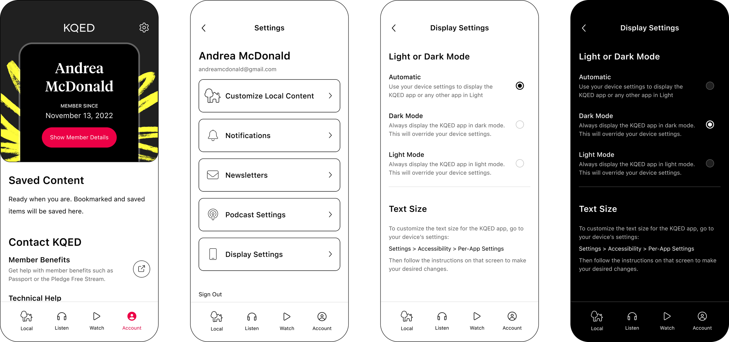
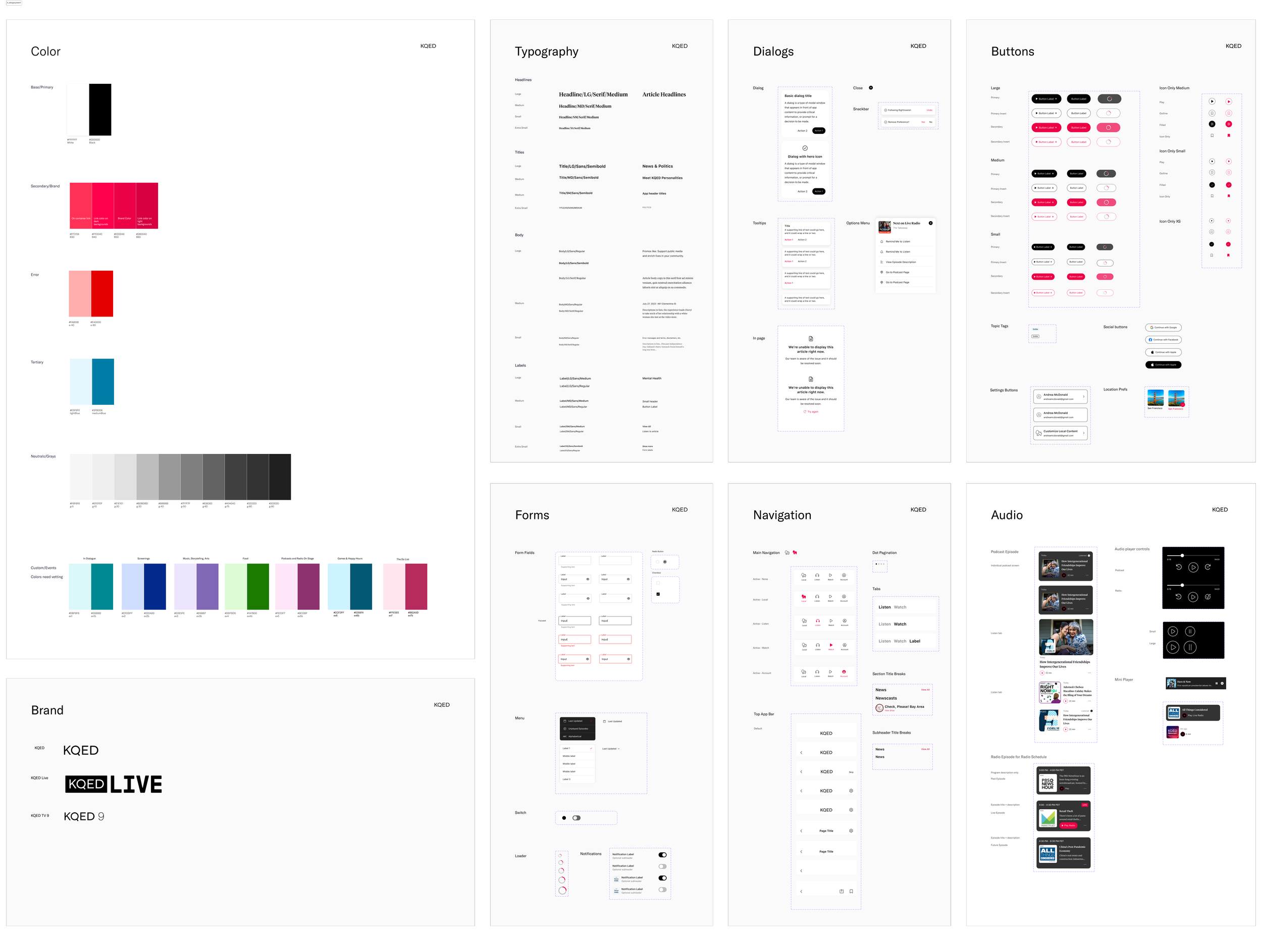
Design System and Accessibility
I built the design system using color tokens and variables in Figma so that it was possible to create both light and dark modes of the app with a single design. While this took time to set up, in the long run it reduced design overhead significantly.
I used the Stark plug-in for Figma to make sure that each color and how it was used met the AA contrast requirement for accessibility. We also made sure that scaled text has room to wrap in the design without breaking the UI.
Figma Color Tokens

Design System
This is a partial view. There are many more components in the system that support video, news stories, account and local feed elements. I had put together many style guides over the years but had never created a full system like this. I really enjoyed creating it and like the color tokens, it ended up saving so much time.